Visualizing Competition: Rethinking How We Display Sports Standings
Tables are the default format for displaying sports standings. Rows of team names, columns of numbers—wins, losses, points. It's functional. It's comprehensive. It's also incredibly boring, and it fails to tell the most interesting story: how close the competition actually is.
I'm a Detroit Red Wings fan. After nine years of missing the playoffs, this season feels different. As I've watched games, commentators keep talking about how tight the Atlantic Division is, but when I pull up the standings online, I just see a table. The Red Wings are first, sure, but the visual format doesn't help me feel how precarious that position is.
The Problem with Tables
Standard standings tables prioritize completeness over insight. Every data point gets equal visual weight—games played, wins, regulation losses, overtime losses, points, goal differential. For someone trying to understand their team's playoff chances, this creates cognitive load. You have to mentally calculate gaps, understand point systems, and contextualize what matters.
In hockey, a win is worth two points. An overtime or shootout loss is worth one. This means the gap between teams isn't just about wins—it's about accumulated points, and those gaps tell stories about competition intensity.
A Different Story
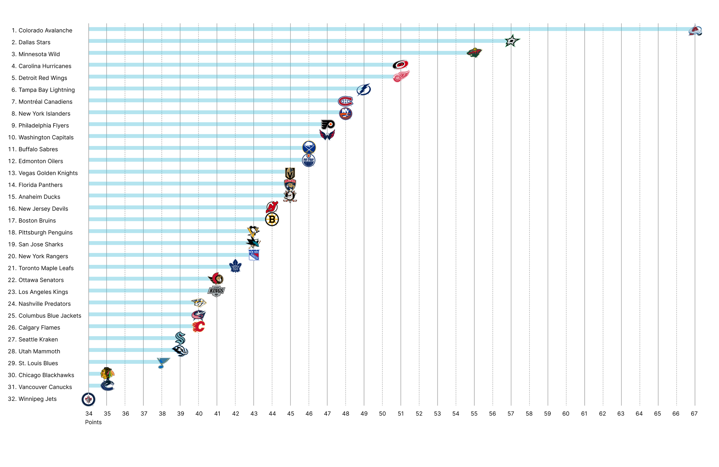
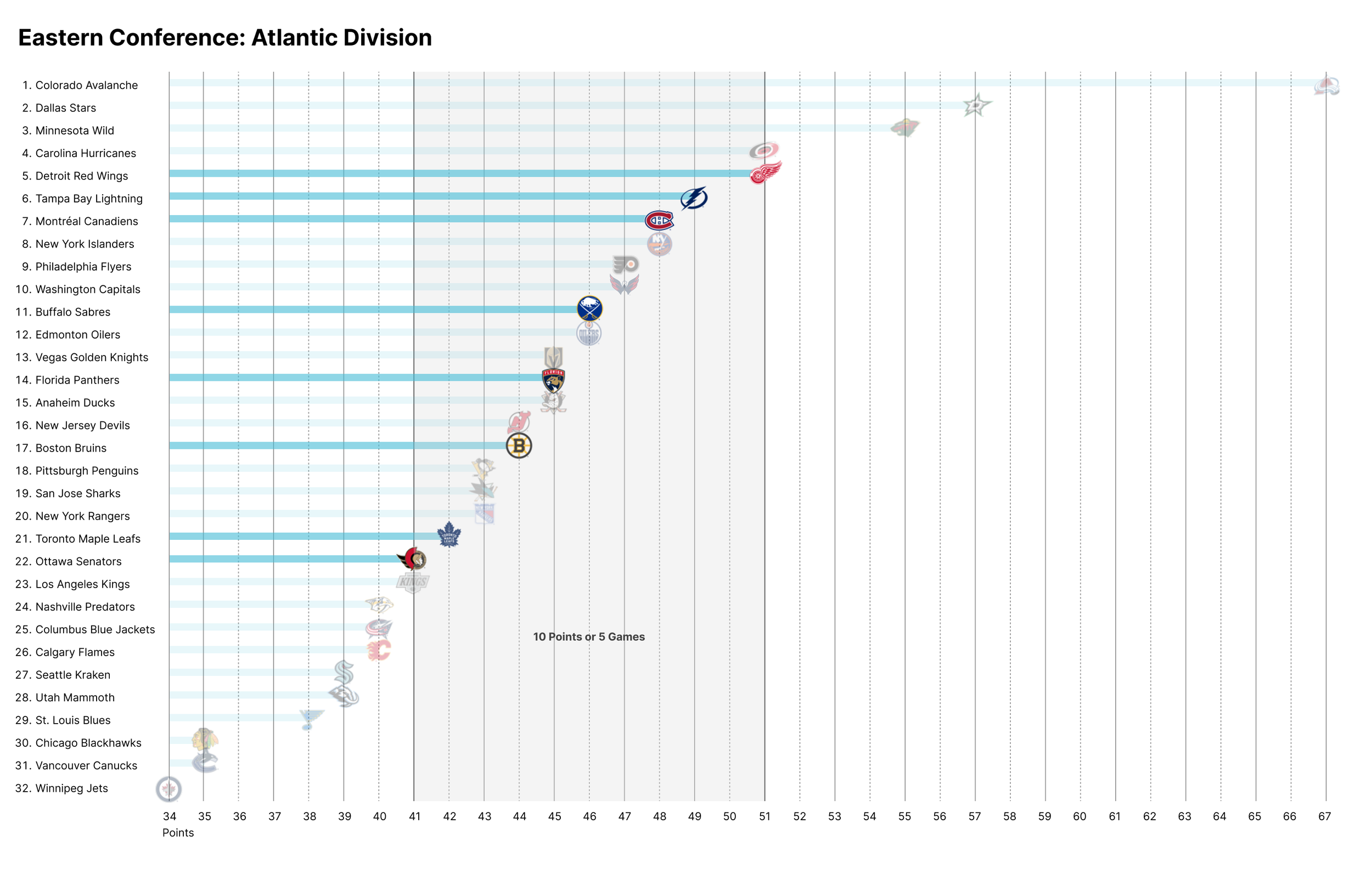
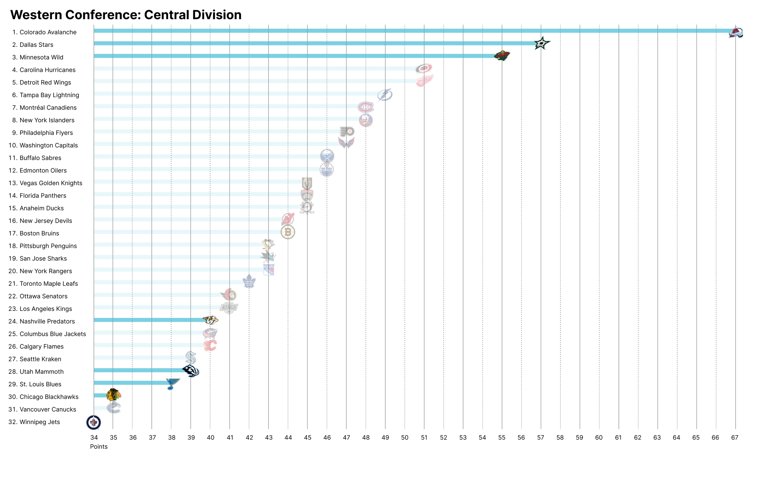
Pulling the data out of a table lets us paint a picture with this season's data (as of December 31, 2024):
The Colorado Avalanche are first in the league with a commanding lead—ten points ahead of second place. That's essentially five games. They're running away with it.
Now look at the Atlantic Division, where the Red Wings sit in first. Ten points separate first place from last place in the division. The same gap that Colorado has over second place is the entire spread of our division. We're not dominating—we're surviving in a tight race.
Compare that to the Central Division: thirty-three points separate first from last. Sixteen games worth of difference.
Design as Storytelling
Every design choice is a choice about what story to tell. Tables tell a story of completeness and precision. They're designed for recordkeeping, not understanding.
But sports are narratives. They're about comebacks, collapses, impossible odds, and nail-biting finishes. Our visualizations should reflect that drama. We should feel the tension of a tight division race, sense the dominance of a runaway leader, understand the desperation of a team fighting for a playoff spot.
The data is already dramatic. We just need to design it that way.